
The bad days, with the condition level 4 or less, are overlaid on the activity chart as the red vertical lines:
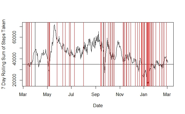
Here are some observations:
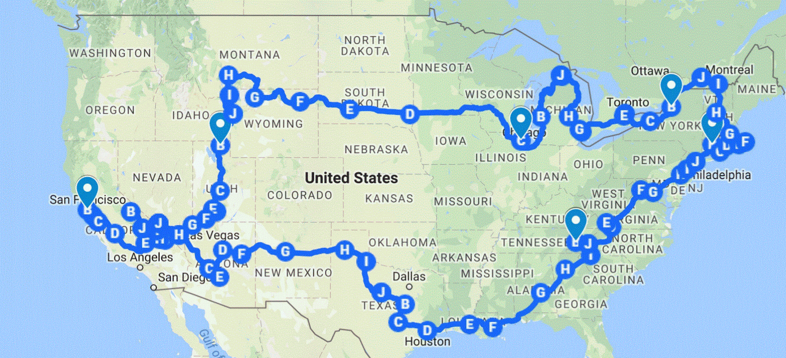
- There is no red line in late March and April. This is when I was on the move.
- Thick lines appear in early May when we stopped in Virginia.
- The lines disappear again till we settled in NYC in June.
- Then the lines get denser as we approach July. This is the post-trip struggle in NYC.
- Lines disappear in August as we got back on the road.
- Thick lines in the middle of September when we stopped for a week in Mesquite.
- Once we got back home, the lines became regular as before.
- Similar pattern appears while we traveled to Paris in Oct and Nov. It was less conclusive though, because it was only for a month.
- Ignore thick lines in Dec and Jan. This is when I was having flu.
These observations agrees with what I observed before:
- The novelty of taveling elevates the crash threshold
- When the novelty fades, so does the elevation effect
- When the elevation effect dissipates, post-trip struggle sets in.
- The post-trip struggle ends quickly when traveling resumes.